Café Lafayette
Japanese influences and bushranger motifs are an unlikely pairing, but standing out in Melbourne’s crowded café scene requires unwavering self-assurance plus an element of surprise.
In its experimental mixture of flavours, dishes and design, Café Lafayette serves up an entirely unexpected café experience.
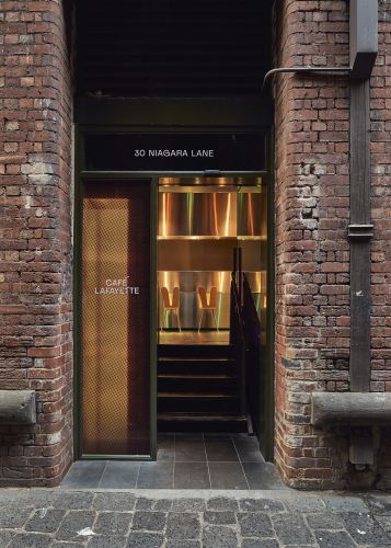
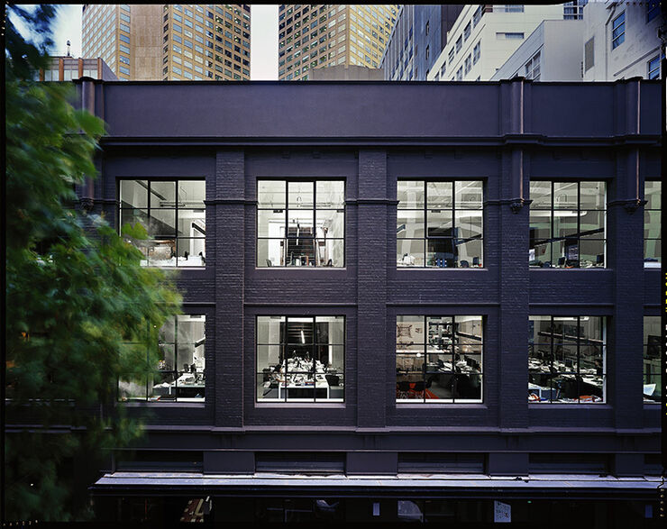
Starting with a heritage-listed converted townhouse in the Australian city’s centre, the café’s interior evolved in tandem with the brand identity. Through this process, an immersive, authentic brand experience was created, celebrating the historic elements while bringing to life the wonder of being transported to another place.
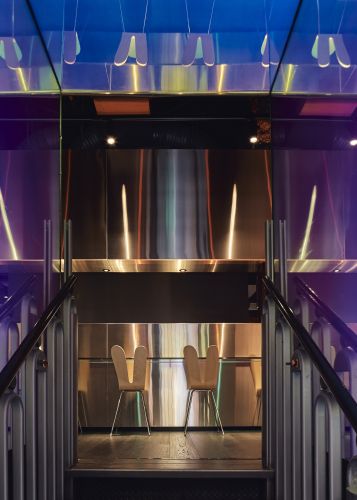
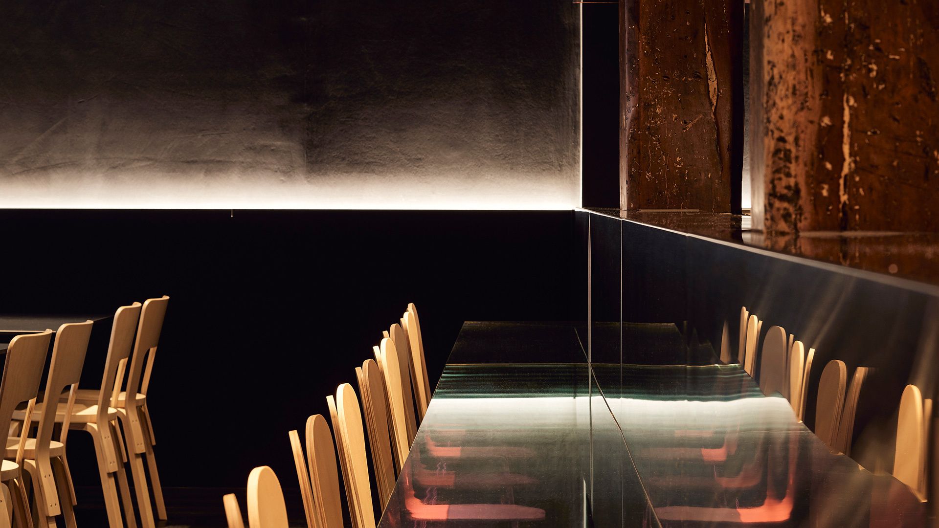
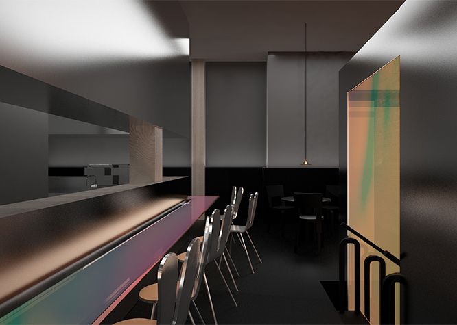
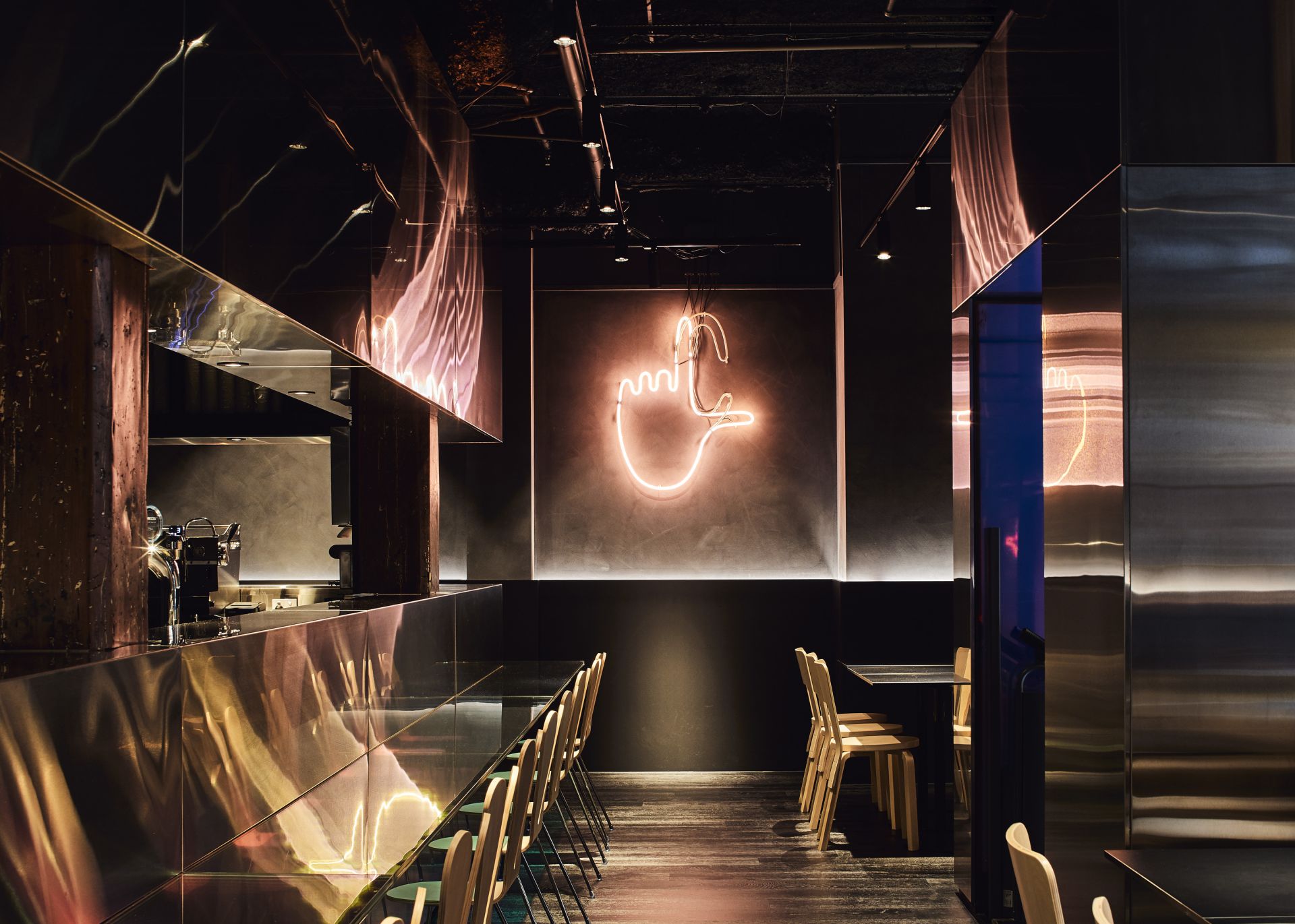
The Japanese-influenced menu is the inspiration for the sushi-style bar, with an Australian twist in a low slot that takes its cues from the helmet of infamous bushranger, Ned Kelly.
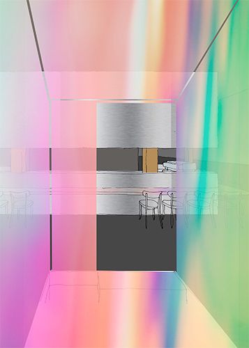
Just as the café’s novel dishes and flavour combinations dazzle diners, the pairing of dichroic glass and stainless steel creates a kaleidoscope of colours spilling out across the surfaces – easily exceeding the brief to be instantly Instagrammable.
Location
Melbourne, Australia
Status
Year
Scale
Design team
Imagery
“The building is [more than] 130 years old, so we wanted to do something with old Melbourne meeting the new Melbourne, with its many international people, students, tourists – and of course, the locals.”
