A welcoming workplace
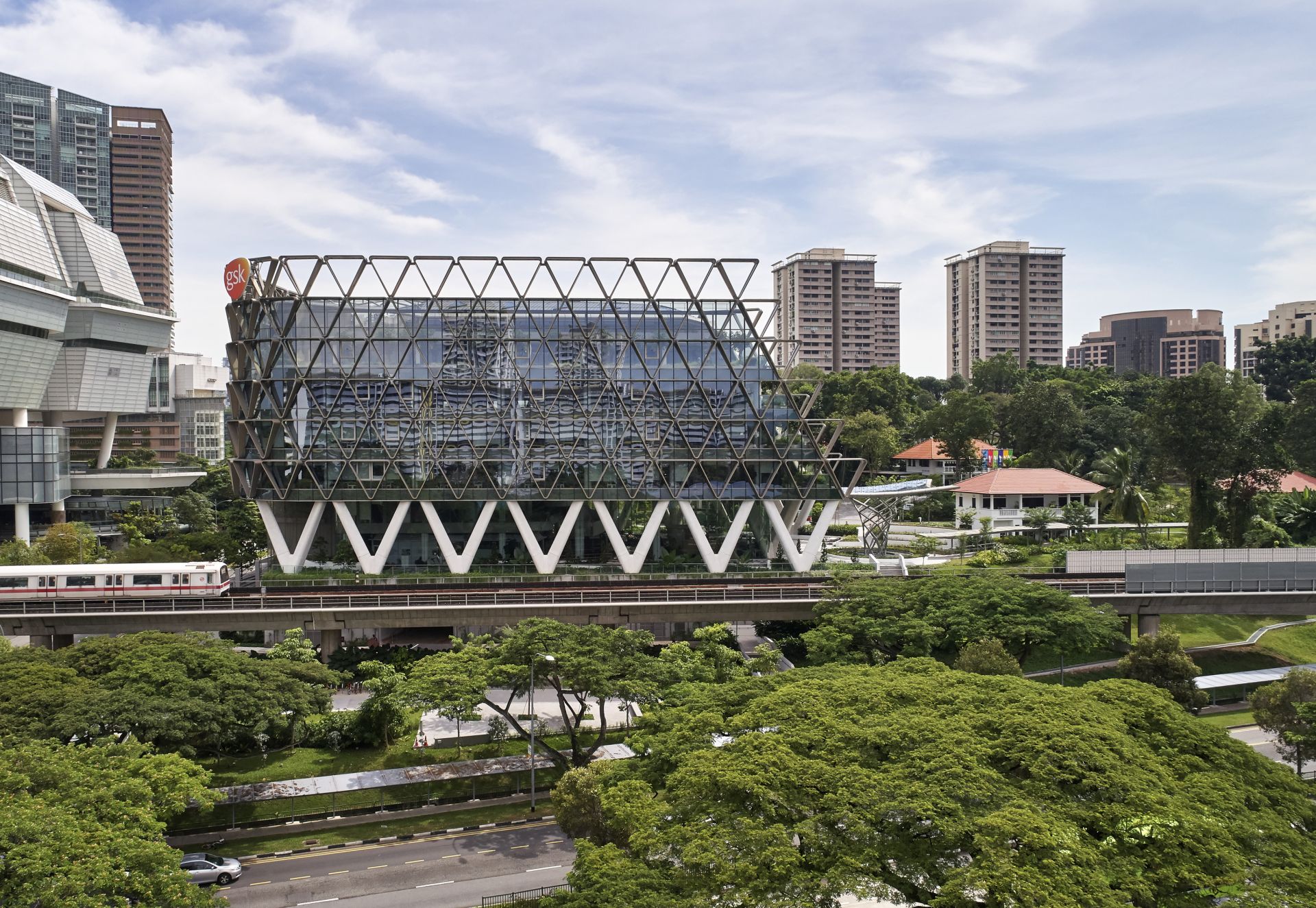
PETER DEAN: The building connects with both the low-rise heritage buildings on the site and the physically dominating Star Vista that sits behind it. More importantly, I think it’s changed the way that Singapore looks at ground level building surrounds, showcasing the benefits of public access and using these spaces as a natural extension of the workplace.
RGM: One of my favourite things about GSK is how the ground floor and surrounds feel inviting and accessible. It’s so different to what you’d expect from a typical corporate headquarters. Can you explain a little about how this was planned?
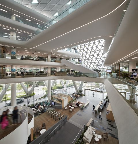
PD: GSK was overt about wanting a lot of community engagement, but they also needed privacy and security. By consolidating all lifts and staircases into one single core, we made the rest of the ground floor areas and public atrium the dynamic heart of the project. The design creates welcoming external spaces and sight lines from external areas into the workplace while maintaining secure access.
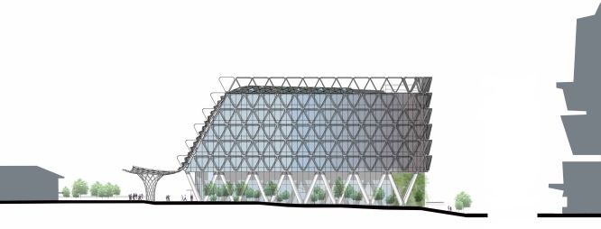
TBS: The building gracefully sweeps down to the scale of the heritage buildings that surround it within the park, integrating with the rich history and native landscape of the site.
Relifing a part of Singapore’s history
RMG: How did you integrate the heritage bungalows into the larger building operation?
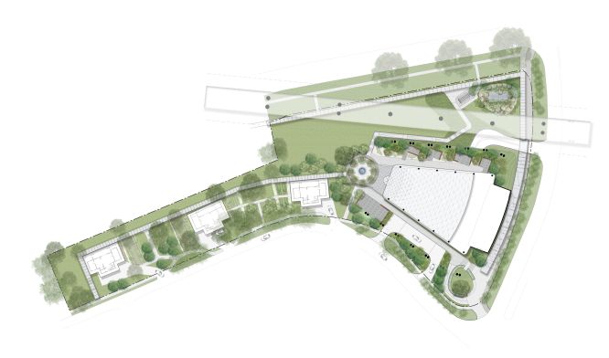
TBS: We thought about the site as a campus from the outset. So, rather than considering the bungalows as separate buildings, we thought about the entire campus experience and how to purposefully use those spaces while retaining their charm. Giving the bungalows clear functions meant that it felt like one workplace with both new and heritage buildings.
Not many GSK employees knew that the company has had four Nobel Prize winners. We named each of the bungalows after one of these winners, stitching them into an interesting narrative that connects employees to the heritage and legacy of their company.
PD: The height of the main building’s undercroft is the same height as the heritage bungalows. It’s a subtle gesture, but it creates a comfortable sense of connection to scale when you’re entering the building. The approving bodies were very complimentary about how the design turned the bungalows into a key asset.
RGM: How did GSK’s setting within lush Rochester Park near The Green Corridor inform its design?
TBS: I’m proud to say we added 60,000 carefully chosen native plants to the site – inside and outside the building. They’ve developed beautifully in these three years.
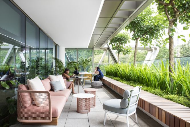
We had this clear vision that we wanted everyone to feel like they were arriving at a park and walking through that park right until they reached their desks. This principle also extended to the natural light-filled spaces and the playful park furniture throughout the workplace.
PD: We also worked closely with the engineers on the quality of indoor air. The building features one of Singapore’s first fully underfloor air distribution systems, which adds to the sense of holistic wellbeing.
Sustainability and wellness built-in
RGM: On the topic of resilience and sustainability, Hassell is one of the founding signatories of Architects Declare in Australia and the UK, and now in Singapore, too. What are some of the meaningful concepts around sustainability, wellness and liveability that were coded into the architecture?
TBS: One of the key aspects of sustainable design is good daylight control, so we designed GSK to offer access to daylight and ensure a good variety of settings dispersed around the workplace and give people the choice of where to work at different times of the day. The combination of the central atrium and solar orientation have increased daylight access by more than 50 percent when compared against conventional commercial floorplate design, impacting the ability to save on energy consumption.
We introduced a beautiful sun shading element on the façade, reducing glare issues on the west-facing areas by more than 80 percent.
PD: The horizontal sunshades taper to let in the early morning sun but block the midday heat and piercing afternoon sun.
A lot of options were tested through parametric modelling to confidently create the most site-specific building façade.
TBS: Another key strategy was targeting budget for impact. Investing in an adaptable floorplate means GSK can reconfigure in the future without spending millions of dollars. Designing a rigid floorplate makes it hard for organisations to adapt and it’s unsustainable if natural organisational change means ripping out obsolete materials.
RGM: GSK was completed three years ago and designed almost seven years ago – and it’s meant to last for another 20. Tell me how you moved beyond just sustainability compliance and today’s standards to design for longer term sustainability?
TBS: I think it’s about moving beyond the sustainability scorecard into thinking about how a space impacts people’s wellbeing. A key feature was providing only 31 carparking spaces for 1,000 employees and more than 120 bicycle parking spaces. This encourages employees to use the public transport network, increases mobility, and significantly reduces the carbon footprint on the site as a development. It’s the first commercial project in Singapore of its kind to achieve these metrics.
Designing for flexibility
RGM: What’s one aspect of the building design that’s particularly relevant in this time of COVID-19?
TBS: It was designed as a ‘workplace campus’ with a high level of agility – for example, it’s 100 percent wireless. This has enabled GSK to rapidly pivot the use of the workplace supporting essential employees working both in the building and from home. Employees had already been used to this high level of agility and activity based working over the years, and now it’s allowed the building to be flexible during the crisis without the need to spend money on physical upgrades.
RGM: What did you learn from designing GSK’s headquarters that you’ve taken into subsequent projects?
PD: Designing the building from the ‘inside out’ and putting the workplace first is central to understanding how to develop a successful building response. On this project we continually tested options for how people weave their way through the workplace – making their typical journeys around the office via the cascading central stair, the bridge links, secondary stairs and social hubs work not just for efficient movement but also for communication and connection. This thinking has informed projects I’ve worked on ever since.
TBS: We challenged preconceptions and ideas – our own, our client’s and current standards for sustainability and building. Sometimes it’s tempting as designers to work through our own filters, but at the end of the day we’re agents for the client – and for the people who will occupy the building over time. Ultimately it’s about designing places people love.
